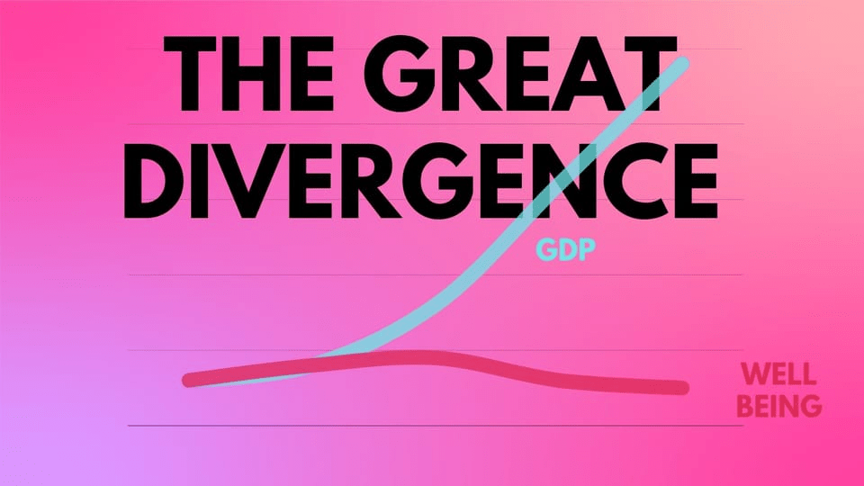
Now think about what the data’s telling us. Macro indicators, micro indicators—things are just fine. Well-being—things are crushing, terrible, people are in despair and ruin. This is the Great Divergence in action.
How can this be, though? How can these statistics all disagree? Remember, well-being data was invented because GDP and its ilk faced a powerful critique: they weren’t very good measures of human welfare. I could break your arm, and GDP would go up, because you’d have to pay the doctor. So well-being data were created to reality-check old-school indicators based on orthodox, dated economics. And in this situation, they tell us that the orthodox indicators are giving us major errors—false positives.
Let’s think about just how that can be, in hard terms, now. The economy’s “growing”—but the average person’s “cashflow negative,” barely breaking even if they’re lucky, living hand to mouth. What does that mean? How can that happen? Pretty easily—when all that “growth” goes to the top tiny fraction in a society, who are earning it through predatory means, which is why everyone else can’t make ends meet. This is one of the doomsday scenarios, if you like, that well-being indicators were created to reality-check—only then, it was theory, and today, it’s coming true.

Leave a comment